Terracotta has moved beyond Mediterranean kitchens and garden pots, it’s now one of the most sought-after colors in bedroom design. This warm, earthy hue brings instant coziness without feeling heavy, making it ideal for spaces where relaxation is the priority. Unlike trendy pastels that fade from popularity or stark whites that feel clinical, terracotta offers a grounded, timeless appeal that works across design styles from modern minimalist to bohemian eclectic. Whether someone’s repainting walls, swapping out textiles, or adding strategic decor accents, terracotta delivers visual warmth that transforms a bedroom from ordinary to inviting.
Table of Contents
ToggleKey Takeaways
- Terracotta bedroom ideas work across multiple design styles—from modern minimalist to bohemian—offering a timeless, grounded appeal that transforms spaces without feeling heavy or trendy.
- Paint selection requires testing samples in your room’s specific lighting conditions for 48 hours, as terracotta shades shift from soft peach in morning sun to deeper rust at dusk.
- Textiles like terracotta duvet covers, throw blankets, and curtains provide a low-commitment way to test the color while softening its appearance compared to painted walls.
- Layer terracotta with complementary colors using the 60-30-10 rule: 60% dominant neutral, 30% terracotta, and 10% accent colors like sage green or navy blue to prevent visual monotony.
- Incorporate terracotta through multiple design elements—lighting with warm bulbs (2700-3000K), ceramic decor pieces, brass hardware, and upholstered accent furniture—to create visual interest at multiple levels.
- Terracotta hides minor wall imperfections better than lighter colors and provides subtle warmth without additional heating, making it practical for older homes with poor insulation.
Why Terracotta Is the Perfect Color Choice for Bedrooms
Terracotta sits in that sweet spot on the color wheel, warm enough to feel cozy, but not so saturated it overwhelms a space. The color derives from natural clay, which gives it an organic quality that pairs well with wood tones, natural fibers, and both warm and cool neutrals.
From a psychological standpoint, terracotta tones promote relaxation without the drowsiness that darker reds can trigger. The color has been linked to feelings of security and comfort, making it a practical choice for a room designed around rest. Unlike cooler grays or blues, terracotta adds warmth without requiring additional heating, a consideration in older homes with poor insulation.
Practically speaking, terracotta hides minor imperfections better than lighter colors. Scuffs, shadows, and uneven drywall texture become less noticeable under medium-toned pigments. For DIYers tackling a bedroom refresh without extensive wall prep, that’s a real advantage. The color also reflects light differently throughout the day, shifting from soft peach in morning sun to deeper rust at dusk, which keeps the space visually interesting without additional effort.
Terracotta Wall Treatments That Make a Statement
Walls offer the most impactful way to introduce terracotta into a bedroom. The approach depends on the room’s size, natural light, and existing architectural features.
Accent Walls and Paint Techniques
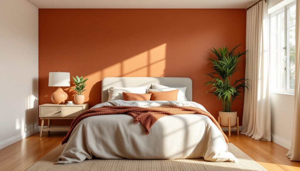
An accent wall behind the bed is the most common application, and for good reason. It creates a focal point without committing every wall to the color. For this approach, choose the wall with the headboard or the one opposite the door for maximum impact when entering the room.
Paint selection matters. Look for paints labeled as “terracotta,” “burnt sienna,” or “clay”, but always test samples first. Paint chips lie. What looks perfect in-store can read too orange or too brown depending on a room’s lighting. Apply two sample squares on the target wall: one in a spot that gets morning light, another that stays shaded. Live with them for 48 hours before committing to gallons.
For coverage, expect 350-400 square feet per gallon for quality paints with good hide (the ability to cover previous colors). Terracotta shades with higher pigment loads may require two coats over lighter primers, but they’ll cover darker existing colors more easily than pastels would.
Textured techniques add depth without additional color. A sponge finish or color wash in two terracotta shades (one lighter, one deeper) creates dimension that flat paint can’t match. This works especially well in rooms with minimal architectural detail. Apply the base coat, let it dry completely (usually 4-6 hours depending on humidity), then dab or brush the second shade in irregular patterns. Wear disposable gloves and keep ventilation strong, VOCs from overlapping wet paint layers can build up quickly in enclosed bedrooms.
Another option gaining traction in modern home design trends involves limewash or clay-based paints in terracotta tones. These create a matte, slightly chalky finish with natural variation. They’re more forgiving of application inconsistencies than standard latex, making them DIY-friendly for beginners. But, they typically can’t be scrubbed as aggressively, so they’re better suited for adult bedrooms than kids’ rooms.
Incorporating Terracotta Through Textiles and Bedding
For renters or anyone hesitant about permanent color changes, textiles offer a low-commitment way to test terracotta in a bedroom. Fabric also softens the color, making it feel more approachable than painted surfaces.
Start with bedding. A terracotta duvet cover or quilt serves as the room’s anchor. Look for natural fabrics like linen or cotton, they breathe better than synthetics and the texture complements terracotta’s earthy vibe. Linen wrinkles easily, which some people love for the lived-in look and others hate. If crisp is the goal, stick with cotton percale or sateen.
Layering matters. Pair a solid terracotta duvet with neutral sheets (white, cream, or warm gray) and add throw pillows in complementary tones. Mix in one or two pillows with geometric or botanical patterns that include terracotta along with other colors, this prevents the bed from looking flat or one-note.
Window treatments provide another textile opportunity. Terracotta curtains in a heavier weave add warmth and improve insulation during colder months, which can reduce heating costs in drafty older homes. For maximum light control, choose curtains with a blackout lining, especially important if the bedroom faces east and gets harsh morning sun. Standard curtain panels are typically 84 or 96 inches long: measure from the rod to the floor and add 2-3 inches for proper length.
Don’t overlook smaller textile touches. A terracotta throw blanket draped over a reading chair, an area rug with terracotta tones, or even a upholstered bench at the foot of the bed all contribute to the color story without overwhelming the space. When working with contemporary interior design ideas, balance is key, too many terracotta textiles can make a room feel monotonous rather than cohesive.
Furniture and Decor Accents in Terracotta Tones
Terracotta works surprisingly well beyond soft goods. Introducing the color through furniture and decor creates visual interest at multiple levels throughout the room.
Upholstered furniture is an obvious choice. A terracotta accent chair in a bedroom corner instantly creates a reading nook. When shopping, test the fabric’s durability, especially for pieces that’ll see daily use. A rub test (rubbing the fabric vigorously with a white cloth) will show if dye transfers easily. Quality upholstery fabrics should have a Wyzenbeek rating of at least 15,000 double rubs for residential use.
Ceramic and clay decor items lean into terracotta’s origins. Terracotta planters, vases, or sculptural pieces add organic texture. Real terracotta (unglazed clay) is porous, so use saucers under planters to prevent water damage on wood furniture. For a more modern take, look for glazed ceramic pieces in terracotta shades, they offer the same color with a polished finish.
Lighting is an often-missed opportunity. Terracotta lamp bases or pendant shades cast warm light that enhances the color throughout the room. Table lamps with terracotta ceramic bases work well on nightstands, while a larger floor lamp can anchor an empty corner. When choosing bulbs, opt for warm white (2700-3000K) rather than cool white, cooler temperatures will make terracotta look muddier.
Artwork and wall decor provide flexibility. Abstract prints with terracotta as a dominant color, woven wall hangings in rust and clay tones, or even framed botanical prints with terracotta mats all tie into the palette. Gallery walls work well if they maintain a cohesive color story, mix terracotta pieces with black-and-white photography or neutral prints to avoid color overload.
For DIYers comfortable with woodworking, consider staining or painting furniture in terracotta. An old dresser or nightstand refinished in a matte terracotta paint creates a custom piece at a fraction of retail cost. Prep is critical: sand existing finish with 120-grit then 220-grit sandpaper, apply a stain-blocking primer if covering dark wood, then use a paint formulated for furniture (higher durability than wall paint). Allow 24 hours between primer and paint coats.
Complementary Color Palettes That Enhance Terracotta
Terracotta doesn’t live in isolation, it needs supporting colors to prevent a bedroom from feeling flat or overly themed. The right palette balances warmth with contrast.
Neutrals are the safest and most versatile pairing. Warm whites, creams, and beiges let terracotta shine without competition. These combinations feel grounded and work across design styles. For a more modern edge, pair terracotta with charcoal gray or soft black. The contrast adds definition without harshness, and the combination reads more contemporary than traditional.
Sage green and terracotta create a natural, almost botanical feel. This pairing shows up frequently in trending bedroom color schemes because both colors draw from nature and complement rather than compete. Use sage in smaller doses, throw pillows, a single accent wall, or artwork, while letting terracotta dominate.
Dusty pink or blush softens terracotta’s earthiness. This combination works particularly well in bedrooms that need a bit more lightness. The key is choosing a pink with gray or brown undertones rather than bright, bubblegum shades. Test samples together before committing.
For a bolder approach, navy blue or deep teal with terracotta creates rich, jewel-toned drama. This palette requires confidence and works best in rooms with ample natural light, as darker colors absorb light. Balance is crucial, if terracotta is on the walls, use navy sparingly in bedding or a single furniture piece.
Metallics add polish. Brass, copper, and bronze all have warm undertones that harmonize with terracotta. Gold-toned picture frames, drawer pulls, or light fixtures tie the palette together with a subtle sheen. Avoid cool metals like chrome or brushed nickel, they’ll clash with terracotta’s warmth.
When building a palette, follow the 60-30-10 rule: 60% dominant color (often neutral walls or large furniture), 30% secondary color (terracotta, whether on an accent wall or major textiles), and 10% accent color (complementary hue in decor and accessories). This proportion keeps rooms visually balanced without feeling formulaic.
Conclusion
Terracotta brings warmth, depth, and versatility to bedroom design without requiring a complete overhaul. Whether it’s a painted accent wall, layered textiles, or carefully chosen furniture pieces, this earthy tone adapts to different styles and budgets. The key is balance, letting terracotta anchor the space while supporting colors and textures provide contrast and visual interest. With thoughtful application and attention to light, proportion, and material quality, a terracotta bedroom becomes a retreat that feels both current and timeless.